
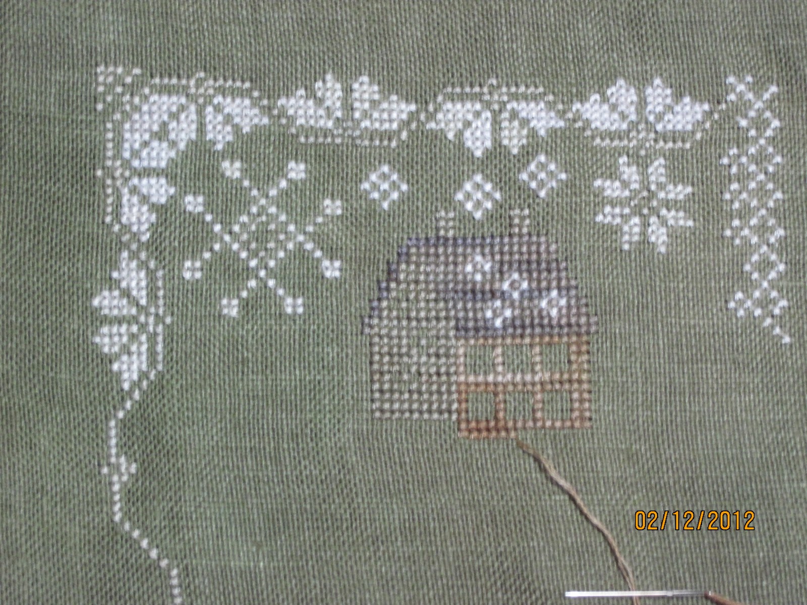
I was happy with everything so far until I began stitching the front side of the house (on the left) with GAST Toasted Barley and realized that the contrast between the roof color which is GAST Woodsmoke is barely discernible. I decided to put the right side house color in before making a decision on whether or not to keep going with the Toasted Barley. Looking at this photo, I'm going to have to find something that has more grey/contrast with the other colors and will still look good on the fabric. I HATE frogging! And this piece has had a lot of it considering how relatively small it is!
4 comments:
I have the same problem with almost every BBD chart I work on - the model doesn't even come close to the fibers in my stash.
I agree with the last commenter. I did a search for them and the differences are amazing. All are lovely in their own way bit all so very different. Have a happy IHSW! x
Hello
Just found your blog.
I love your BBD project.
So it's the same problem that I have. I can't understand why these pictures don't show the real colours of the model. My last BBD project was much better concerning the clours, it was Their Song and the thread colours were pretty much the same. Tomorrow I'll start the February chart and I'm already very curious to see if the colours will corrspond. I'll email you tomorrow evening.
Post a Comment